Baby Design UI Kit
A pastel-themed React component library with an MCP server for AI-assisted development.
Design Credit: Based on the Baby Design UI Kit by Trang Tran. All visual design, color palettes, typography choices, and component specifications originate from her work.
Packages
| Package | Description |
|---|---|
@mcp-baby-design-ui/tokens | Design tokens (colors, typography, spacing) — no React dependency |
@mcp-baby-design-ui/react | React 18 component library (20 components) |
@mcp-baby-design-ui/mcp-server | MCP server exposing 5 tools via stdio |
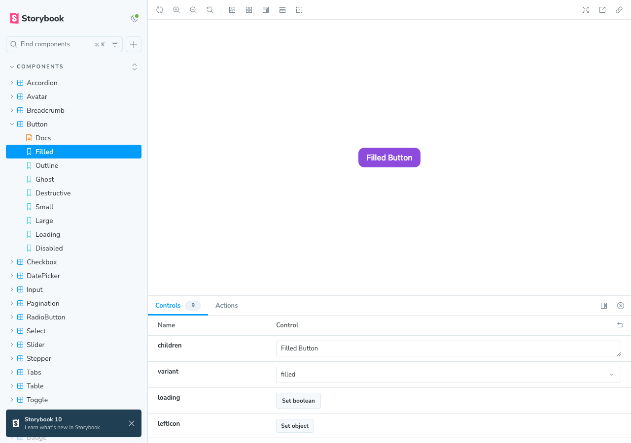
Quick Start
# Install
pnpm install

# Build all packages
pnpm build

# Run Storybook
pnpm storybook

# Run tests
pnpm test
Using the Component Library
npm install @mcp-baby-design-ui/react
import { Button, Input, Modal } from "@mcp-baby-design-ui/react";
import "@mcp-baby-design-ui/react/globals.css";

function App() {
  return (
    <Button variant="filled" size="md">
      Click me
    </Button>
  );
}
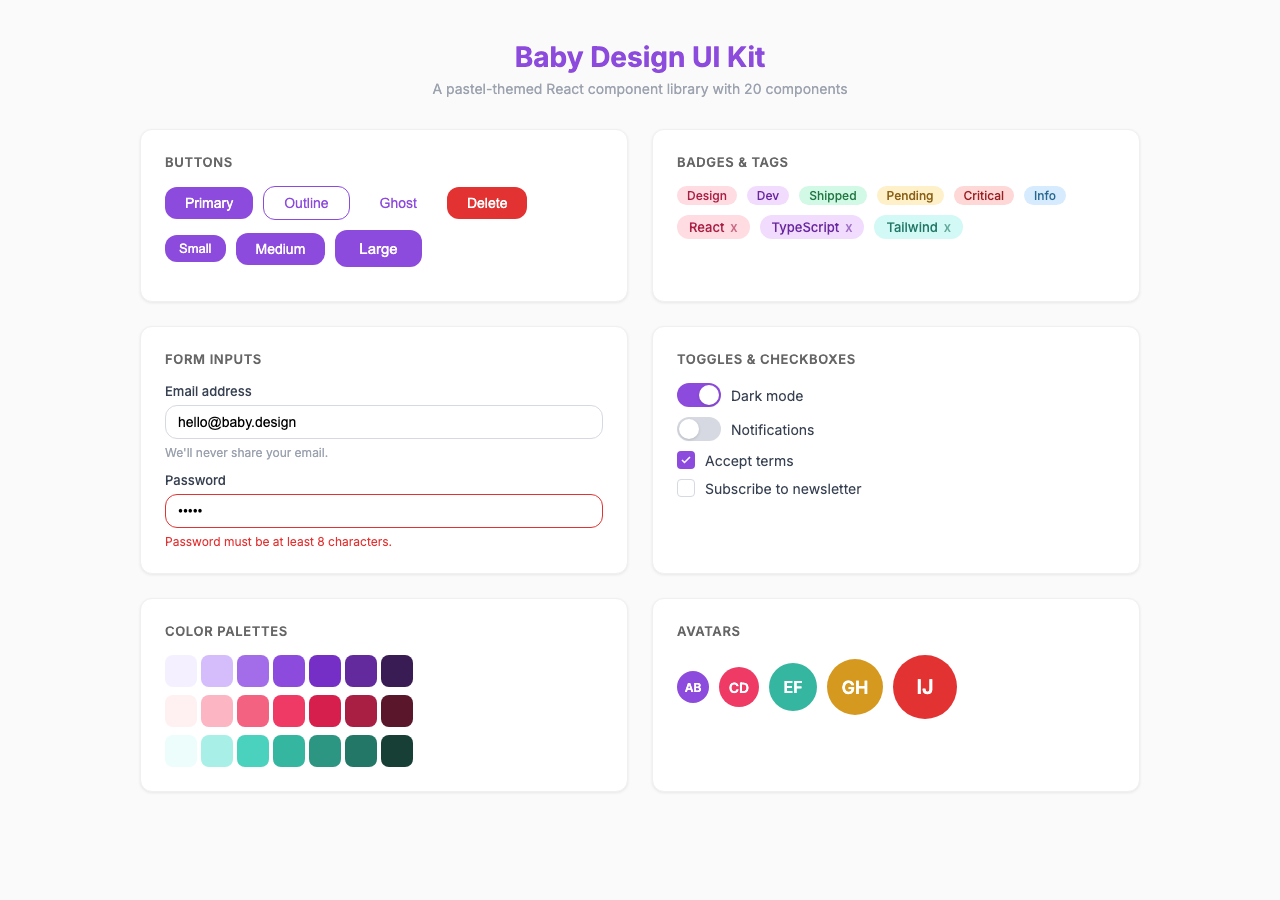
Components (20)
Form Components
- Button — filled/outline/ghost/destructive, 3 sizes, loading state
- Input — text/password/email, label, helper text, char count, error
- Checkbox — default/indeterminate/checked, keyboard navigation
- RadioButton — radio group with arrow key navigation
- Toggle — switch with label, 3 sizes
- Select — single/multi, searchable, custom options
- DatePicker — calendar grid, month/year navigation
- Slider — single value, min/max/step
Feedback & Overlay
- Tooltip — 4 positions, portal-based
- Toast — info/success/warning/error, auto-dismiss queue
- Modal — focus trap, scroll lock, ESC close
- Badge — filled/outline, color variants
- Tag — removable, with icon
Navigation & Data
- Pagination — numbered, prev/next
- Table — sortable columns, compound pattern
- Tab — horizontal/vertical, keyboard navigation
- Stepper — numbered/bar, step states
- Accordion — single/multi expand mode
- Breadcrumb — separator, current page
- Avatar — image, initials fallback
Design Tokens
9 color palettes with 10 shades each (50-900):
- Primary (pink), Secondary (purple), Success (green)
- Warning (amber), Error (red), Info (blue)
- Neutral (gray), Coral, Teal
Plus typography scales, spacing, border radii, and shadows.
MCP Server
The MCP server lets AI assistants discover and generate code for components.
Configuration
Add to your Claude Code or MCP client config:
{
  "mcpServers": {
    "baby-design-ui": {
      "command": "npx",
      "args": ["-y", "@mcp-baby-design-ui/mcp-server"]
    }
  }
}
Tools
| Tool | Description |
|---|---|
list-components | List all components with descriptions |
get-component-docs | Detailed docs, props, usage for a component |
generate-component-code | Generate TSX code with specific props |
get-theme-tokens | Retrieve design tokens |
preview-component | Text preview + code example |
Development
# Build tokens first (UI depends on it)
pnpm --filter @mcp-baby-design-ui/tokens build

# Build UI library
pnpm --filter @mcp-baby-design-ui/react build

# Build MCP server
pnpm --filter @mcp-baby-design-ui/mcp-server build

# Run all tests
pnpm test

# Storybook
pnpm storybook
Tech Stack
- React 18 + TypeScript
- Tailwind CSS + CSS custom properties
- class-variance-authority (cva) for variants
- Vite for library build
- @modelcontextprotocol/sdk for MCP server
- Storybook for component docs
- Vitest + React Testing Library for tests
Credits
Design by Trang Tran — Baby Design UI Kit.
License
MIT